Why should I care about typography?
When creating content, it’s important not just to think about its informative value, but to pay equal attention to the manner in which it is presented. Typography is what is known as the art of written communication. It plays a vital role in engaging with your audience and determines how they read, interpret, and understand. Things as trivial as colour and spacing can dramatically affect the entire look and feel of your content.
An interesting study conducted by psychologist Kevin Larson found that the aesthetic presentation of a piece of content had a direct impact on a reader’s emotional state. In his study, two versions of an article — one with good typography and one with bad typography — were printed out and handed to two different groups. Those who received the article with good typography demonstrated elevated mood and tended to perform better on the cognitive tasks assigned by the researchers. Those who received the badly-designed article demonstrated negative mood — some were reported to even physically frown while reading through the piece. They also performed worse on the assigned cognitive tasks.
How do I pick which typeface to use?
Thanks to the miracle of the internet, content writers have millions of typefaces and fonts to choose from — many of which are even licensed for free. But how should writers choose which typeface to use? The two most important qualities to consider are readability and high contrast.
Readability is the gauge of how easily words, phrases, and blocks of text can be read. When a piece of content is unreadable, it offers no informative value to its audience. Factors to consider when choosing a typeface include:
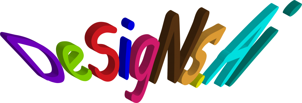
- Invisibility: A typeface should not attempt to draw attention to itself, but to its content. When a typeface distracts a reader with unnecessary features like swashes, tails, distortions, etc., it is a bad choice.

Example of too many distortions
- Spacing: This includes inter-character, inter-word, and inter-line. Spacing must not be too narrow or too wide such that it makes readers unable to make out characters or words. Spacing must also be consistent throughout the text. When it comes to inter-line spacing, as a rule of thumb, it should be 1.2x to 1.5x greater than the font size.
 Example of inconsistent spacing
- Character Clarity: Some fonts have ambiguous characters causing confusion to readers; for example, one particular font has similar-looking “2”s and “Z”s, and “0”s and “O”s. It is essential to pick a typeface that allows readers to easily distinguish characters from each other.

Example of ambiguous characters
Contrast is defined as the state of being strikingly different from something else in juxtaposition or close association. In other words, typefaces must differ from all other elements of a piece. This includes colour contrast, layout contrast, and typeface contrast. When it comes to colour, dark-coloured text should never overlay a dark background. Mix lights with dark in order to create a contrast. It may also help to brush up on colour theory in order to determine which colours go together. When it comes to layout, it helps to mix different elements such as photos, vectors, and text in order to strike a creative balance within a project.
With typefaces, it is generally important to use contrasts to break the monotony of written text. This helps to keep readers interested and engaged with your material. Below are rules you can follow in order to create good typeface combinations:
- Start with an anchor typeface. Think about the mood you want to convey, the content of the text, and the other elements of the project such as the images and colours. All other typefaces used for the project will be based on the anchor.
- Use a similar tone. Some fonts can be described as formal or classic, while others are friendly or modern. It is important to select fonts that generally have the same tone in order to maintain consistency.
- Do not use too many. Keep it to two fonts as much as possible.
What are the different classifications of typefaces?
More and more typefaces are produced every day, expanding the existing classification scheme. Broad classifications include geometric, humanist, modern, slab-serif, old-style, decorative, and script.
- Geometric: Simple geometric shapes influence the construction of these typefaces. The character shapes are made up of geometric forms.

- Humanist: Featuring softly rounded shapes, one of the most legible and easy readouts of all the typefaces.

- Modern: Thin, long horizontal serifs, and clear-cut, thick/thin transitions in the strokes.

- Slab-serif: Characterised by thick, block-like serifs.

- Old Style: Characterised by curved strokes whose axis inclines to the left.

- Decorative: Typically used for titles and headlines as well as small amounts of text in large sizes such as in greeting cards or posters.

- Script: Typefaces that resemble handwritten and calligraphic lettering styles.

What is a ‘type family’?
A type family is a range of typeface designs that are variations of one basic style of alphabet. These variations include weight, character thickness, slant, etc. You’d often see words like bold, condensed, or italicized to describe them. There are no hard or fast rules to determine which typefaces belong to the same family. In fact, over time, type families have grown much larger, even merging with other type families.
Final Thoughts
Many people overlook the importance of a good typeface, but excellent content writers and designers understand the vital role they play in all forms of written communication.
While all the rules and guidelines here appear limiting, don’t be afraid to still have fun and be creative with your projects!
To learn more, check out these typography and font design tutorials.
Visit us here for more content like this in the future!
