Color plays a vital role in communicating with your consumer base. Its power in brand perception, brand recognition, and purchase motivation is virtually unmatched by all other visual components. According to a study conducted, 80% of all information retained by consumers from visual media is related to color.
Brands use specific colors to evoke strong emotional or psychological associations with consumers’ needs, emotions, memories, and thoughts. Something as benign as a change in saturation or hue can drastically affect how consumers feel about your brand. A bad color combination may also threaten the success of your business. Research finds that consumers decide whether or not they want to purchase a product within the first 90 seconds of interaction. 90% of consumers cite color as the primary purchase decision factor.
As a designer or business owner, it’s important to understand color theory and symbolisms to effectively harness their power.
Color Theory and the Color Wheel
Color theory is a term used to describe the collection of rules and guidelines regarding the use of color in design. It is both an art and a science. The color wheel is what is known as the basis of color theory, as it visually maps the relationships between colors. It was invented in 1666 by Isaac Newton to serve as an illustrative organization of the color spectrum.
There are 3 major color wheels: RYB, RBG, and CMYK. These acronyms refer to the primary colors of each wheel. RYB stands for red, yellow, and blue, which are also called the primary colors of paint, while RGB stands for red, green, and blue, which are called the primary colors of light. CMYK differs the most from the group, as it uses the 4 following base colors: cyan, magenta, yellow, and key (black).
The RYB color wheel is primarily used by artists, as it shows the relationship of paint colors mixed together. CMYK is similarly used for offline use as the standard color system for printed material. This is because it has 4 base colors, giving it a wider color range. Both color systems are subtractive, which means that the more color add brings you closer to pure black.
The RGB color wheel, on the other hand, is typically used for digital media. Unlike RYB, the colors on this wheel are additive, meaning the more you add, the closer you get to white. Designs.ai uses the RGB color wheel, as it is designed for online use.
Primary, Secondary, Tertiary Colors
Primary colors are the set of colors that, when mixed together in varying amounts, create all the other colors on the color wheel. They cannot be mixed from other colors. As previously mentioned, the primary colors depend on which color wheel is in use. Red and blue are constant in both color wheels, with green and yellow being interchangeable.
In the RGB color wheel, the primary colors, when added together create pure white light, while in the RYB color wheel, they create pure black.

Secondary colors are the result of mixing two primary colors. There are three secondary colors. In the RGB color wheel, these are cyan, magenta, and yellow, while in the RYB color wheel, these are purple, orange, and green.

Tertiary colors are made by combining a secondary color with a primary color. There are a total of six tertiary colors. In the RGB color wheel, these are orange, chartreuse green, spring green, azure, violet, and rose. In the RYB color wheel, these are red-orange, yellow-orange, yellow-green, blue-green, blue-violet, and red-violet.

Warm and Cool Colors
If you draw a line through the circle of a color wheel, you will easily be able to see the family of warm and cool colors. Warm colors are all the variations of red, orange, and yellow, while cool colors are all the variations of blue, green, and purple.
According to color psychology, different feelings are associated with different color temperatures. Warm colors are typically associated with passion, energy, and happiness, while cool colors are associated with serenity, isolation, and calmness.
Color Combinations
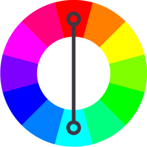
Complementary colors are any two colors which are directly opposite each other on the color wheel. The more opposite the colors are, the greater the intensity of the combination. Complementary colors provide high contrast and reinforce each other’s brightness. Examples of these include blue and orange, red and green, and yellow and purple.
Complementary colors are tricky to use in large doses, but work well when you want something to stand out. This combination, however, should not be used for text and background, as it makes text difficult to read.
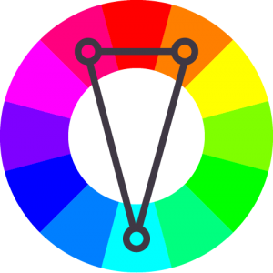
Split complementary colors are a variation of the complementary color scheme. This combination includes 3 colors: a base color, and the 2 colors adjacent to its complement. It has the same visual contrast as complementary colors, but has less tension. An example of this combination is green, purple, and orange.
This combination is a good choice for beginners, as it is difficult to mess up.
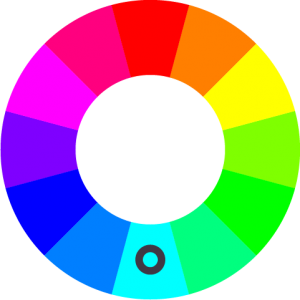
Monochromatic comes from the word mono meaning one. A monochromatic color scheme uses only one color and its associated shades, tints, and tones. This visually looks like a family of the variations of lightness and darkness of a singular color.
A Monochromatic color scheme is a versatile color combination that provides a strong sense of visual cohesion. It is also one of the more subtle and conservative color schemes.
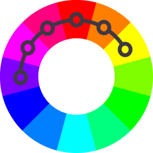
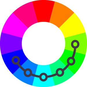
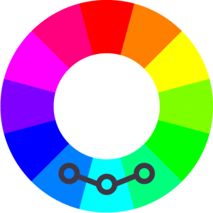
Analogous colors refer to any three colors that are side by side on the color wheel. These types of combinations are often found in nature — such as in the green, yellow-green, and yellow of foliage — and, therefore, create natural harmony. They create serene and comfortable designs that are pleasing to the eye.
The analogous color scheme is versatile, but can become overwhelming when applied incorrectly. To properly use this color scheme, choose one color to dominate, and use the second and third color as support and accent, respectively.
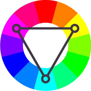
Triadic colors are three colors that are evenly spaced on the color wheel. They provide high contrast but to a lesser degree than complementary colors. They create bold, vibrant color palettes while still retaining balance and color harmony. A basic example of a triadic color combination are the primary colors — red, yellow, and blue.
Similar to analogous colors, in order to apply a triadic color combination correctly, it is important to let only one color dominate, and to use the remaining two colors for accent.
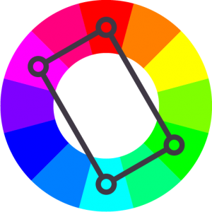
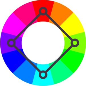
A tetradic color combination is comprised of two pairs of complementary colors. On the color wheel, the distance between these four colors can either form a square or rectangular shape. This color scheme is rich, vibrant, and colorful. It offers plenty of possibilities for variation.
Tetrads are a very aggressive color scheme, making them the most difficult to balance in a harmonious way. In order to apply this scheme correctly, choose one color to act as the dominant color, and allow the rest to accent. It is equally important to pay attention to the blend of warm and cool colors in the design.
 .
.
Shades, Tints, and Tones
Shades, tints, and tones are created by adding black, grey, and white to a base color.
A shade is created by adding black to a base color, increasing its darkness. Shades tend to be richer, darker, and, often, more intense versions of the original color. Even a small amount of black added can change the character of a hue. Such changes in the gradient of a color adds complexity to colors and creates depth in the designs.

A tint is the result of adding white to a base color, increasing its lightness. Tinting desaturates a color, making it less intense. The result of this process is often called a pastel color, and they strike people as calmer, quieter versions of the base color. The lightness of the color depends on the amount of white added.

A tone comes from adding grey to a base color, or by combining both shading and tinting. Depending on the proportions of black, white, grey, and the color chosen, tones can be darker or lighter than the original hue. They can reveal subtle and complex qualities in a hue that was previously not apparent.

Aforementioned, the right color tones and hues set the tone for your design. To get the mood of a design just right take help of color palettes options and get inspired with color combinations that are just right.
Hex and HSL Color Codes
As previously mentioned, Hex and HSL are both codes used to communicate color to computers. Hex is a shorthand for Hexadecimal. It uses 16 base symbols to create a 6-digit code. These 16 symbols include numbers 0 to 9, and letters A to F. The number 0 is the smallest representation of color; it is almost the total absence of color, while the letter F represents the strongest intensity — about 15 times the color strength of 0. For example, Black uses the Hex code #000000, while White uses the Hex code #FFFFFF.

 The Hex numeral system also uses the RGB color wheel, with its 6-digit code expressing the mix of red, green, and blue. The first two digits shows the amount of red in the mix, the second two shows the amount of green, while the last two shows blue. To illustrate, 2019’s Color of the Year, Living Coral, has a Hex code of #FF6F61.

HSL, on the other hand, stands for Hue, Saturation, and Lightness. According to the computer graphic researchers that created it in the 1970s, HSL more closely approximates how human vision perceives color. This color system reimagines the organisation of colors into a 3D cylindrical geometric shape.
Found on the top face of the cylinder is the RGB color wheel. Saturation is measured by the distance of the point to the center. The closer to the center, the lighter the color and vice versa. Lightness is the third dimension. This axis, on its own, appears as a gradient of white to black, with the highest point being pure white and the lowest point being pure black.
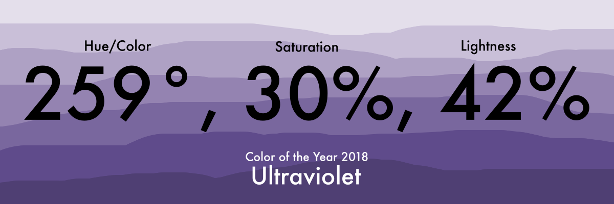
Hue is expressed in degrees (°) as plain numerical value (0 to 360), while saturation and lightness are expressed as percentage (%) values. To illustrate, Ultraviolet — Color of the Year 2018 — has an HSL code of (259°, 30%, 42%).
A simpler undertaking of this concept is understanding thw concept of contrast in design. The use of complementary contrasting hues make for a good mix between the colors and content within a design. The Color Checker aspect of Color Matcher does just this, ensuring that right combinations of colors are chosen for a design.
