If you are a content creator on YouTube, you know how important it is to have the right thumbnail for your videos. It is a window, a fleeting glance, into what kind of creator you are – aesthetic, quirky, structured, etc – and what your video is all about. Of course, the right vibes are imperative! But perhaps it’s also worth iterating how vital a good thumbnail is in increasing the number of views your video gets.
On YouTube, everyone judges a book by its cover.

The number of clicks your video gets is strongly related to how visually pleasing your thumbnail is to the user. Your video thumbnail not only has to look good, but it also has to STAND OUT among the other videos on the viewer’s YouTube home or search page.
There are numerous ways that your video can show up on a potential viewer’s screen. They could have searched a target keyword you used, it could have been recommended to them from the YouTube algorithm, or perhaps they are subscribed to you. (Keep in mind, this is true for other video makers as well!) This occurrence is called an impression. An impression, simply put, is the amount of times your video thumbnail is shown to YouTube users.
However, not all impressions are turned into views. Your thumbnail can change that! Think of the process as a funnel. First, your video appears among several others on the viewer’s screen in one of the ways mentioned above. Then, the viewer quickly scans through the thumbnails and their eyes land on the one that sparks their interest the most. With a quick glance at the video title, they click on the video and voila! The video gets a view.
Here are some pointers in creating a great YouTube thumbnail:
- Ensure your color selection is suitable for your video content.
- Pay attention to the font you use – it communicates more than you realize.
- Include an image of yourself for an instant connection with your audience.
- Pilot test it!
A good thumbnail should ideally consist of the following elements:
1. Captivating Colors
Using the right colors can draw the attention of potential viewers. Colors have the power to set the tone, create a mood, incite emotion – you get the message. It’s important to understand the meaning behind colors. It would also be helpful to note the specific emotions that are incited by certain colors. For instance, the color yellow is often tied to cheerfulness and optimism.

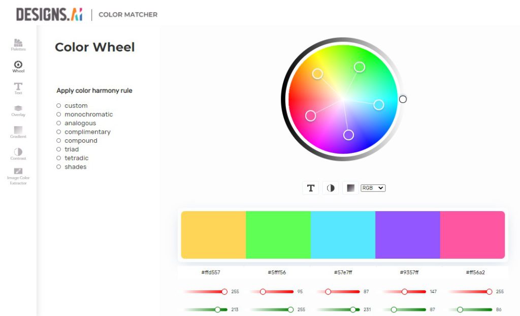
That said, be mindful of the fact that not all colors go well together. A helpful tool for a better understanding of color combinations and meanings is Color Matcher. Color Matcher is your go-to if you need an automatic color palette generator. The color wheel that is A.I.-generated allows you to easily extract colors to be integrated into your designs, for a whopping amount of zero dollars. Yes, it’s free. Speaking of free, your color choices can now be headache-free! Yeah, I’m looking at you, the color-uncoordinated.
2. Intentional Typography
Your typeface, size, and arrangement should all be given extra thought. I’m sure we’ve all been victims of presentation slide decks plastered with that one Chiller font (I bet you know the one) despite the subject matter being the human digestive system.

The point here is, be sure to choose an appropriate font for your thumbnail. It not only has to have the right words on it, but the font used can also communicate your personality so you should utilize that! Yes, you read that right: fonts can do that much. Your typeface has the ability to convey a modern feel (the Futura font in yellow, anyone?), a retro vibe, a romantic tone, and more. Explore your options using this resource here. The Font Pairer gives you an infinite amount of font combinations which is easily downloadable, too. If you need a guide, this tool is just for you.
3. A Mugshot
And by that, I mean: your face. Consider using an image of yourself in your thumbnail. Depending on your personal style and video content, including an image of yourself with a strong expression would help pique the interest of potential viewers. Whether it is a shocked expression, or a defeated one, they would want to know what events caused that reaction from you.

A more subtle variation of this suggestion would be to include an image of you clipped from your video. That way, potential viewers will get a glimpse of what your video holds. This personal touch will allow your video to be more engaging to the users, and it adds a certain je ne sais quoi, no?
Graphic design isn’t your passion?

Are you overwhelmed yet? I know, I know. Not all of us are born creatives or have any background in graphic design. Fret not, there’s no need to sound the alarm.
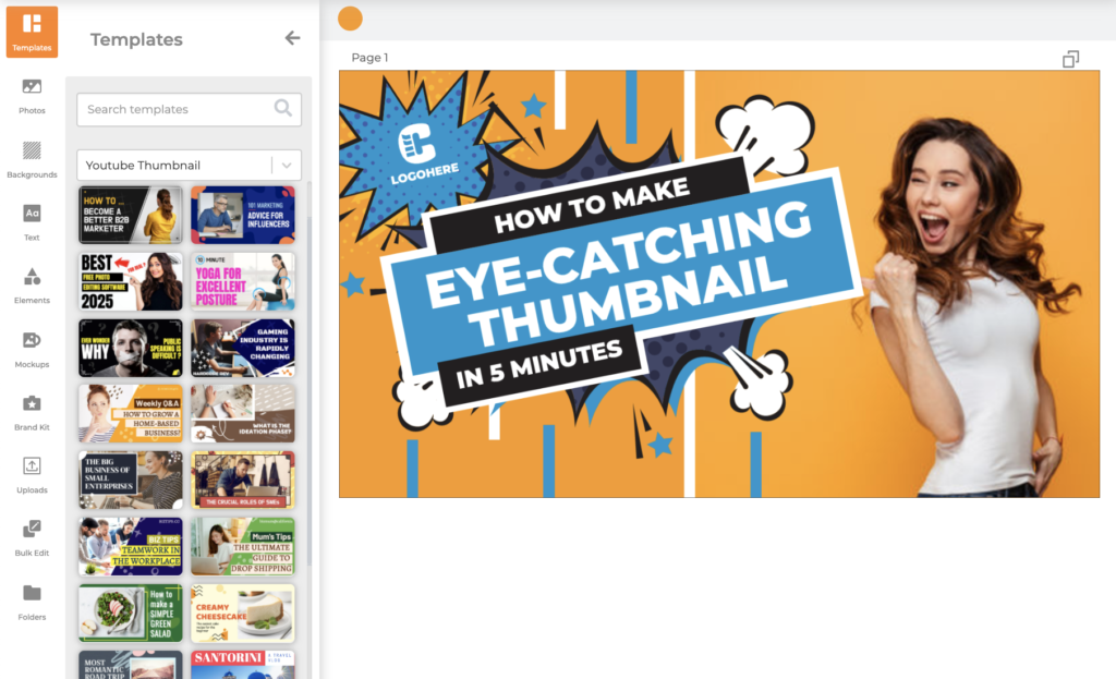
If you happen to be lacking in creative juices, I recommend you use an A.I.-powered software that intuitively generates stunning design templates such as Designs.ai’s Designmaker. These templates are also conveniently categorized according to any desired themes and content. Designmaker will generate a template that you can use for a dynamic YouTube video thumbnail, in no less than 2 minutes.
Actually, it generates hundreds. You’ll be spoiled for choice. Once you’ve chosen a template that suits you, you can begin editing and customizing it to suit your liking. Add your own flair and style! As soon as you’re satisfied with the results, you can download your masterpiece and upload it as your video thumbnail. Like taking ice-cream from a baby!
Time to experiment.
Well, now that you’ve created a bomb dot com thumbnail – what’s next? Designmaker just generated a huge amount of template variations for you. How do you know the one you chose will get you your clicks?

This is where you can experiment. You should save another one or two alternative thumbnails that you’ve worked on into your Projects tab on the platform. The keyword here is alternative – it shouldn’t be too similar to your Main Pick thumbnail. After uploading your first variant, give it a few days and monitor its performance on YouTube (you can get your analytics from your YouTube Studio). If your video does not garner the reaction you aimed for, try changing your thumbnail to your Plan B thumbnail.
This is a game of trial and error. With enough test runs, you’ll be able to understand exactly what type of thumbnail generates the highest number of clicks – essentially, what your target audience wants to see from you. Patience here is definitely required, but a thorough understanding of this information will benefit you in the long run. In time, you will be able to bypass the pilot test stage and immediately produce a thumbnail with high success rates.
Some parting advice.
When it comes to content creation, visual marketing is key. When you have found what works, in terms of thumbnail creation, stick to that style. This will amount to a consistent and aesthetically harmonized grid of videos on your profile. You know when you open a menu and its contents look so delicious and make you want to order one of everything? I think you get my drift. Oh boy, your viewers won’t even know where to begin.

Still not following? Here’s a clue: What makes YOU click on the videos that you do? Take a good look at the video thumbnails of your favorite creators and get some inspiration there. Make notes of what you like, and what you don’t. Incorporate the elements that make you tick (or rather, click… pun intended) into your own work. Of course, add your own personal character to it. Your videos are an extension of you and what you’re like, so your thumbnails should reflect that.
Your identity has to emanate from each and every one of your videos. As technical as thumbnail-creation can get, at the end of the day, your loyal audience wants to experience you as a person via your videos. So go with your instinct, make decisions based on what feels right and you’re on the right track. After all, in a world where everyone is fighting to be in the spotlight, authenticity is a very attractive quality to have.
In short, it pays to make a good first impression. Especially on YouTube.
Putting a little elbow grease into something you are passionate about will always reap the best rewards. Your audience will be able to recognize the amount of effort you put into producing your content to ensure that it is enjoyable to them, and they will appreciate it.
That being said, while your input is definitely important, you don’t necessarily have to struggle in creating from scratch anymore. There are online tools for you to take advantage of which are not only easy but speedy as well. You don’t even have to break the bank. Designs.ai is a one-and-done suite of tools that come in handy for any content creator on any platform – your potential is limitless.
Read More:
