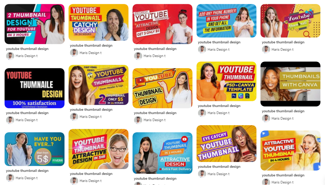
In today’s digital world, visual content is king, and YouTube is no exception. YouTube is one of the largest video-sharing platforms on the internet, and millions of people visit it every day to watch videos on various topics. With such a massive audience, it’s essential to create content that stands out from the rest. One way to do this is by designing an eye-catching YouTube thumbnail. In this blog, we’ll discuss the key elements of an effective YouTube thumbnail design as well as how Designs.ai can help you to create the perfect YouTube thumbnail.
The Importance of Design in Creating a YouTube Thumbnail

Design is critical when it comes to creating a YouTube thumbnail. It’s the first thing viewers see, and it needs to grab their attention and make them want to watch the video. A well-designed thumbnail can help your video stand out in a crowded field and increase your click-through rates.
Here are some essential elements to consider when designing a YouTube thumbnail:
Use Eye-catching Colors in Your YouTube Thumbnail
Colors play an essential role in design. They can evoke emotions and create a mood that resonates with viewers. Using bright, bold colors in your thumbnail can grab viewers’ attention and make them want to click on your video. However, it’s crucial to ensure that the colors you choose match the tone of your video and don’t mislead viewers.
Include Text in Your YouTube Thumbnail
Adding text to your thumbnail can help communicate your video’s topic and entice viewers to click on it. The text should be clear and easy to read, and it’s best to keep it short and sweet. Use a font that’s easy to read and matches your brand’s style.
Use High Quality Images in Your YouTube Thumbnail
The image you choose for your thumbnail should be high-quality and relevant to your video’s topic. Avoid using blurry or pixelated images, as they can turn off viewers and make them think your video is low-quality.
Create a Clear Visual Hierarchy
A clear visual hierarchy helps viewers understand the thumbnail’s content quickly. It shows them what the video is about and what they can expect to learn or see. Place the most important elements of the thumbnail, such as the title and image, in prominent positions to catch viewers’ attention.
Keep Your YouTube Thumbnail Simple
A cluttered thumbnail can be confusing and turn off viewers. Keep your design simple and focused on the video’s topic. Don’t try to include too many elements, as this can make the thumbnail look busy and overwhelming.
Create a YouTube Thumbnail with Designs.ai

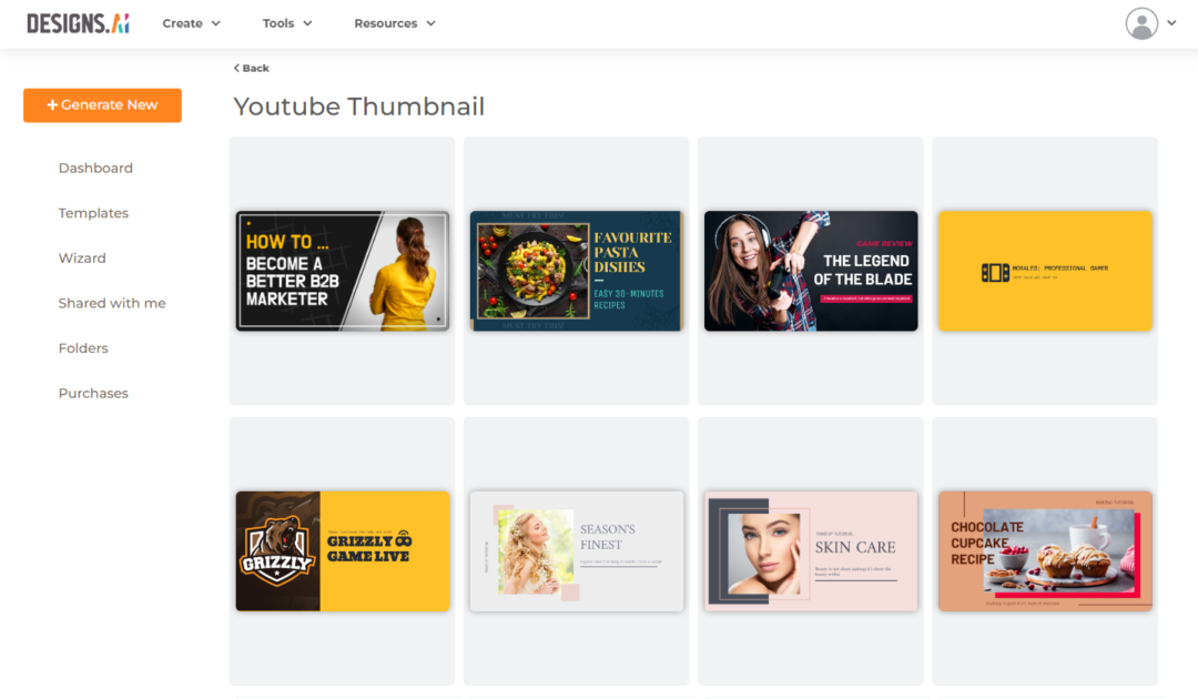
Designing a YouTube thumbnail can be challenging, especially if you’re not a graphic designer. Fortunately, there are tools available that can help you create professional-looking thumbnails quickly and easily. Designs.ai’s Designmaker offers a range of YouTube thumbnail templates that are easy to use and customizable.
Designmaker’s templates include a range of layouts, colors, and fonts, making it easy to find the right one for your video. All you need to do is add your text and image, and you’re ready to go. Their templates are optimized for YouTube’s dimensions, so you don’t have to worry about resizing or cropping your thumbnail.
In conclusion, designing a YouTube thumbnail is crucial to getting viewers to watch your content. A well-designed thumbnail can grab viewers’ attention and increase your click-through rates. If you’re not a graphic designer, consider using Designs.ai’s YouTube thumbnail templates. They’re easy to use and customizable, making it easy to create professional-looking thumbnails in no time. If you’re a content creator looking for video content ideas, check out our blog on video ideas here.
