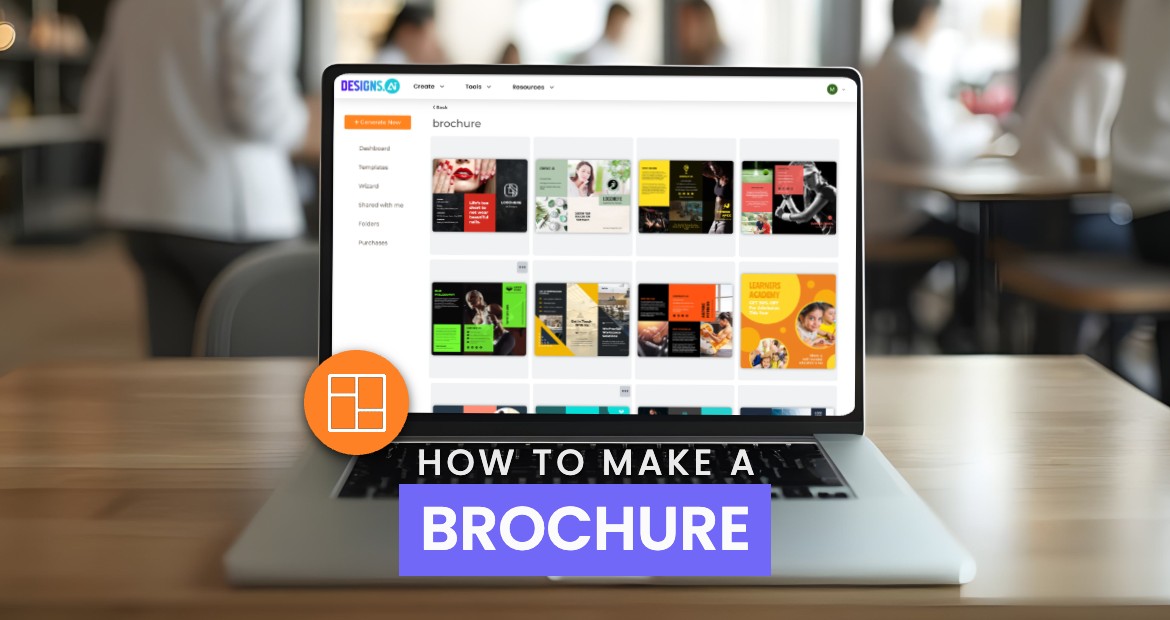
Brochures are one of the best ways to communicate what you want to tell your audience. Whether you are providing a piece of detailed information, using it as a menu, or simply establishing a connection with the audience, brochures give you the freedom to convey your message. Hence, today we will learn how to make a brochure online with the help of the best – Designs AI.
What is a Brochure and Why is it Important?
Brochures are the most affordable advertising tools that help you advertise your business. A brochure consists of folded sheets that contain images, text, graphics, and other visuals to engage, inform, and convince the reader.
A brochure serves multiple purposes, such as sales support, brand awareness, information circulation, promotion and marketing, educational materials, event promotion, and much more.
Here is why a brochure is important for your business –
- Brochures help you capture the attention of your audience, especially regarding emerging businesses that have restricted budgets.
- They provide a good way to interact with your audience and generate leads to follow up.
- They are budget-friendly as well as more effective than product advertisements in newspapers and magazines.
- Including contact details on the back of brochures enhances their effectiveness and encourages readers to engage with your business.
Planning and Research
Identify the Purpose of Your Brochure and Know Your Potential Customers
Before diving into the design process, it’s crucial to identify the purpose of your brochure and understand your potential customers. This foundational step ensures that your brochure hooks the target audience’s attention and effectively communicates your message. Start by asking yourself:
- Who is the target audience?
- What are their needs and pain points?
- What message do you want to communicate?
Understanding your target audience is key to creating a brochure that resonates with them. Consider their demographics, interests, pain points, and goals. For instance, if you are designing real estate brochures, your audience might be homebuyers looking for detailed property information and high-quality images. Tailoring your brochure design and content to meet these specific needs will make it more effective.
Outline Your Brochure Content
Once you have a clear understanding of your audience and the brochure’s purpose, it’s time to outline the content. A well-structured outline helps organize the information, choose the right brochure template, and ensure the content resonates with your audience. Your outline should include:
- Introduction: A brief overview that captures attention.
- Main Message: The core information you want to convey.
- Key Benefits: Highlight the advantages or unique selling points.
- Call-to-Action: Encourage the reader to take the next step, whether it’s visiting a website, making a call, or attending an event.
By outlining your content, you can create a custom brochure that effectively communicates your message and engages your target audience. This step is essential in ensuring your brochure design is both informative and visually appealing.
Types of Brochures
- Bi-fold – Helps create a professional-looking creative with a second page.
- Accordion fold – It folds in like an accordion to show a long row of panels Each panel has different information.
- Tri-fold – Three columns present detailed information in a compressed format.
- Single open gate fold – Opens like a gate. The front cover has basic information and inside panels have additional information.
- Double gate fold – Similar to a single open gate fold, a double gate fold has 2 folds instead of 1.
- Z-fold – It is similar to a tri-fold brochure, but it folds differently. It allows the natural flow of information.
- Roll fold – It has multiple panels folded and rolled together in progression.
- Half-fold – Paper is folded in half and usually stands upright.
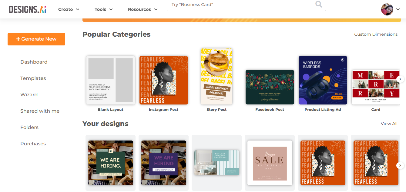
How to Make a Brochure Using Designs AI
Designs AI is the best tool to consider when designing a brochure for your business. Designs AI offers a free brochure maker that allows users to create visually appealing brochures using professionally designed templates. It provides different editing options such as templates, backgrounds, elements, mockups, animations, bulk edits, and much more. Start designing your brochure with Designs AI today with the help of the details given below.
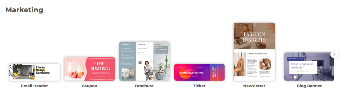
Choosing the Right Template in Design Maker
You get to choose from a variety of unique design templates which are easy to use and customizable, allowing you to easily create your own brochure.
Here’s a list of templates –
- Social media
- Ads
- Events
- Marketing
- Documents
- Prints
- Blank layout
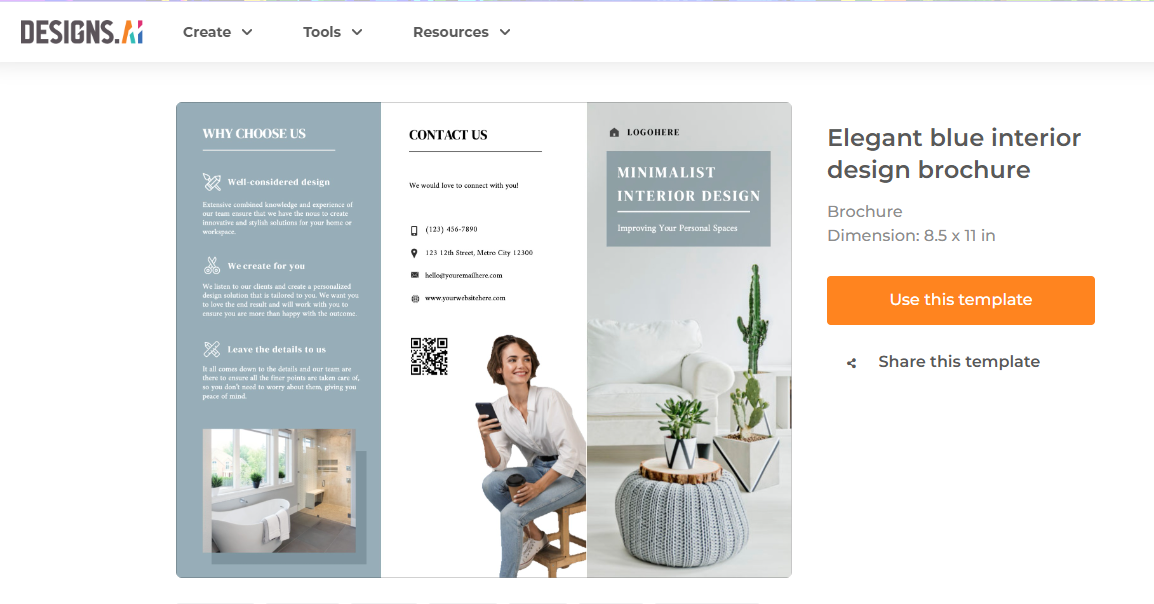
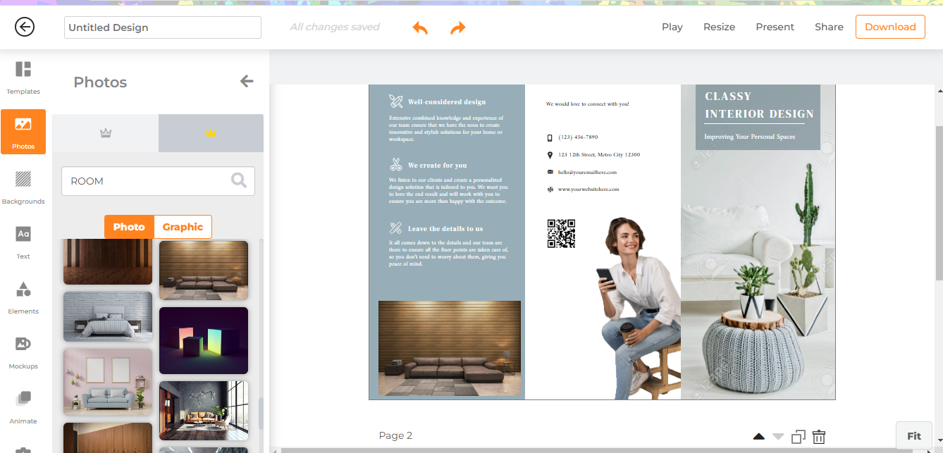
For example, I need a brochure for my interior design business. Here’s a template I can choose.
Adding and Customizing Text and Images
Designs AI allows you to customize text and images present in the template. Using your own images can enhance engagement and clarity in the brochure. You have the freedom to customize everything in it and allign it with your brand’s synergy.
Using Bulk Edit Tools for Professional Design
Designs AI has a feature called bulk label that allows you to create similar items in a single batch. It is very useful when you require multiple variations of a label with different information. Additionally, Designs AI allows users to upload their own photos, enhancing the customization process and making the brochure more personalized. You can create multiple versions quickly by changing details such as names, numbers, etc.
Key Elements of an Effective Brochure Design
Clear Messaging and Visual Hierarchy
Clear messaging is very important. It delivers your brand’s purpose and product/services stably. Structure the information so that the key points are highlighted. This way, you can guide readers’ eyes in a logical order. A strong visual hierarchy helps you to make the brochure look visually appealing and easy to use. Utilizing a stock image library can provide a wide selection of images, icons, and illustrations that enhance the visual presentation of the brochure.
Choosing the Right Colors and Fonts
Choosing the right colors and fonts is important to support a professional look. Colors should resonate with your brand identity and be used consistently. Fonts should be harmonious; keeping a bold header font with a simple body font works well.
Real-world Businesses Use Cases
- Product Launches – Brochures are used to introduce new products, highlighting benefits, features, and USPs.
- Real Estate Listings—Brochures showcase property details in an accumulating format, including pricing, location, and high-quality images.
- Healthcare services – Healthcare centers make brochures to educate patients about health services, wellness programs, and treatments.
- Tourism – Tourism agencies use brochures to highlight tour packages and attractive deals to attract tourists.
- Educational Institutions—Brochures give an overview of schools, training institutes, and universities’ facilities, programs, and admission details.
Tips for Engaging and Persuasive Copy
- Use action-oriented language
- Focus on the benefits you provide
- Use clear language
- Highlight USPs
- Use bullet points
- Tell a story
- Use powerful graphics
Common Mistakes to Avoid When Making a Brochure
Missing headlines –
Use headlines to break your content into smaller paragraphs and highlight the important points. If you do not use headlines, people may miss out on important points.
Overcrowding –
It is a big turn-off for customers is overcrowding of the details. Hence, keep a lot of white space to separate text and include only the important points.
Spacing –
Extra space or uneven margins look distracting. You may miss this point while designing the brochure, but it might look very prominent in a printed copy. Hence, make sure you keep an eye on this aspect and always print a copy before finalizing the brochure.
Multiple fonts
Multiple fonts can create a visual mess. Not more than 3 fonts to be used to differentiate headlines, main body, and CTA.
Poor image quality –
Low-quality images make your brochure look bad. Hence, use high-quality images and stay away from poor image quality.
Multiple colors –
A colourful brochure looks attractive but using too many colors will look garish. You must have a pre-determined color pallet to create a brand synergy with your brochure.
Frequently Asked Questions
What is the purpose of a brochure?
A brochure is a flyer that is used to market a business to educate potential customers about its product, service, or benefits.
What should I include in a brochure?
A brochure should include a headline, contact information, brand elements, text, graphics, and a call to action.
How do I make a brochure without design skills?
You can use online design platforms like Designs AI, or Canva, which offer pre-made templates. You can customize these templates by adding images, tet, and adjusting colors. Even if you have no experience in designing, you have the leverage to simply select a template that fits best for your needs.
How can I make my brochure look professional?
- Choose the right fonts
- Use high-quality images
- Add a CTA
- Be creative
- Keep your message clear and concise
- Craft an eye-catching headline
What are the most common brochure formats?
In the US, the most common brochure formats are –
- A4 (8.5 x 29.7cm)
- A5 (14.8 x 21cm)
- Letter size (8.5” x 11”)
- Tabloid size (11” x 17”)
- Legal size (8.5” x 14”)
Can I create a brochure with free brochure templates using Designs AI?
You can create a brochure for free with Designs AI. However, you will need to subscribe to paid plans for commercial-use rights, and premium features.
What are some common mistakes to avoid in brochure design?
- Overcrowding of text
- Poor quality images
- Missing out on CTA
- Using too many colors
- Grammar errors